Been looking at alternative font-replacement techniques of late, and have just received my beta invite to TypeKit.com. The idea behind their service, is that they host the fonts, you pay a monthly fee, and you can embed whatever font from their lib into your site via js and css. No flash/image/php replacement techniques, no hiding text off the page, it’s the font as you want it.


Poster Collection – 2 – AGAM
I really enjoy this poster, and the work of Yaakov Agam in general.
Continue reading
Posted in Postacrds
Le Tour de Adobe
Well, it’s that time of the year again, the Tour de France has once again begun in ernest. Because of the time difference here in Australia, i’d usually be sitting in front of the telly growing dark eyes for the hours of 11 to 3 watching the coverage live.
Continue reading
Posted in Interaction
Unique records in AS3
I’m sure others already know this little trick – but in case you didn’t…
The filtermethod for Arrays in Actionscript 3.0 comes in handy if you want to (ahem) *filter* certain elements out of your array :
var tmpArray:Array = ["oranges", "apples","oranges", "pineapple", "carrots", "oranges"];

var fruits:Array = tmpArray.filter(function(e, i, a){

   var isUnique:Boolean = (a.indexOf(e) == i);

   return (isUnique);

}, this);

trace(fruits.toString());
Continue reading
Posted in Interaction
Communication Convergence
In the past 12 months, many things have happened. The world has seen an unprecendented global shakedown of financial services, America welcomed in a black president, a well respected and seasoned newspaper filed for bankrupcy, and the catch phrase “chk chk boom!” entered the Australian vocabulary. Just to name a few. And every one of the events of the past 12 months has been recorded, distributed, discussed and discovered on the interwebs.
Continue reading
Posted in Thoughts
A year in the doing
I really wanted to start this post with “well…” – but I thought that would be a little to predictable. But that’s what things feel like. 1 year has passed since I blogged anything of note – and my how time goes by! Last time I shouted into the interweb void I was busy trying to learn AS3, attempting to document my poster collection, building coffee tables, and reflecting on my interactions with the world. So what happened? Why the long absence? Well, nothing really – I haven’t been absent per se, more occupied.
Continue reading
Posted in Postacrds
Poster collection – 01 – Obey With Caution
Ive been meaning to begin cataloging the collection of prints I have from various exhibitions, events and artists. Well, to start things off, here’s my favourite piece : Shepard Fairey’s Obey With Caution .
Continue reading
Posted in Design
A few days on PaperVision3D
So last week I had the opportunity to get my hands dirty with PaperVision3D. As mentioned previously, the company I work for has been responsible for implementing the 2008 Earth Hour website.
Well, as part of that, I had a crack at visualising the global support being given to the Earth Hour movement. Using AS3, I first load in a zipped text file containing lat/longs of each user sign up, and of those users broken down by country, which I uncompress and iterate over to create textures. I then use PaperVision3D to generate a set of spheres which I wrap the textures around, and add some simple mouse interactions.
I settled with an early release of the engine – but am keen to have a go at the 2.0 branch and see if it speeds things up.
Flash 9 player is required to view this content. It can be downloaded from Adobe.com
Posted in Design, Interaction
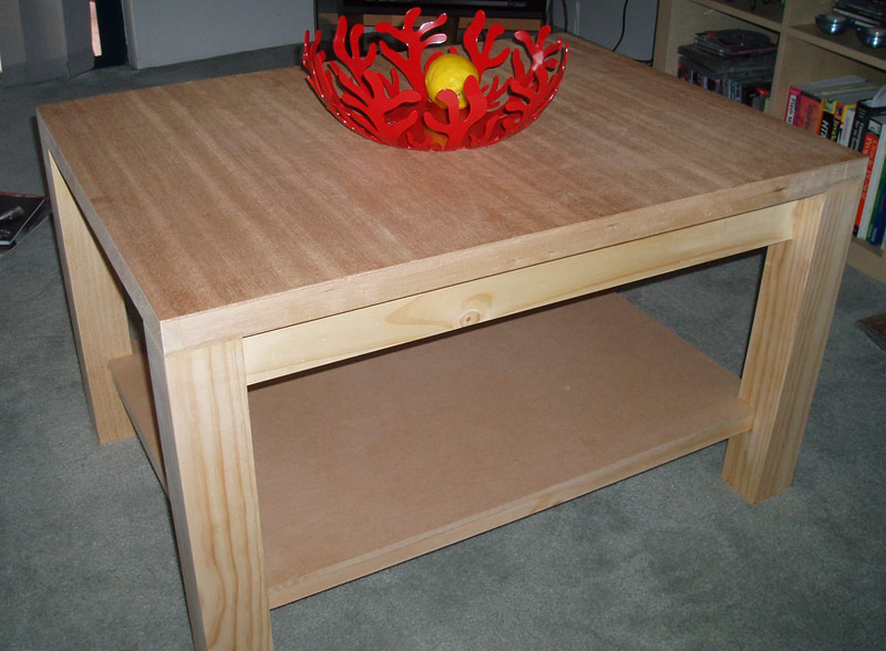
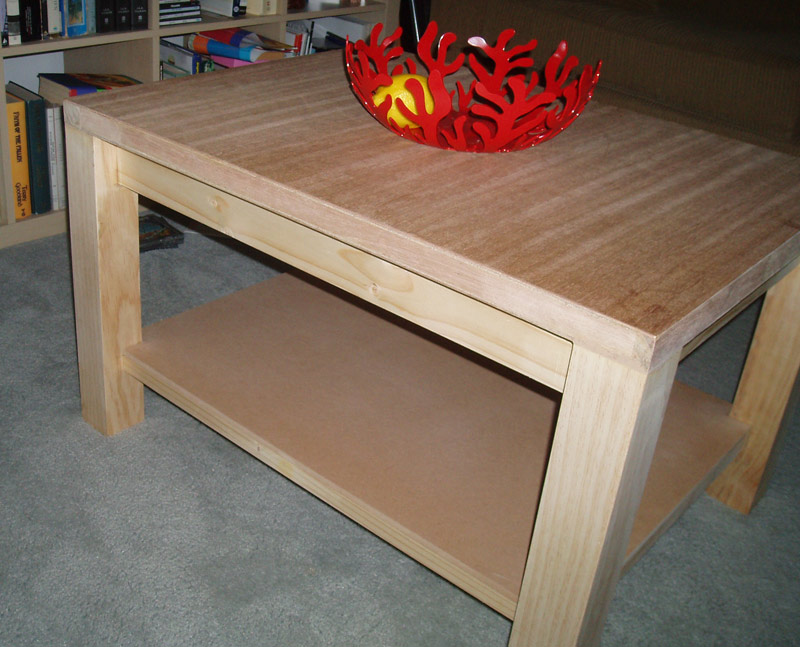
The new Coffee Table
So, what to do when your presented with a week off? You could spend time catching up on the InterWebs, you could try and reply to all those emails asking you to buy Viagra or rescue some Nigerian Prince from the global credit crunch… or you could do something rewarding and totally offline. I chose the latter (something I’m doing more and more these days when I can get away with it ![]() )
)
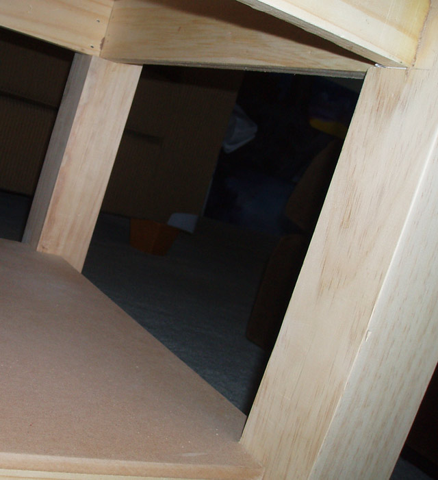
Yup, nothing Ikea about this puppy – not a single allen key was harmed making this coffee table! Unfortunately I didn’t have the presence of mind to take shots as I was building it, so you’ll just have to take my word.
Materials
The top is actually an offcut from a solid-core fire rated maple door. Very heavy, but has an excellent grain. I (with some help from my step father Roger), had to repair one end of the offcut, filling it with a spare piece of maple trimming – because the internal cavety of the door is filled with particle board which looks butt ugly!
The shelf is another spare piece of MDF that Rog had lying around, with the rest of the table made out of pine (the legs were bought from Bunnings for 20 bucks each). Because of the design, each leg needed to have mortiose joints to accomodate the shelf, and rebates cut at the top for the tabletop brackets.
The bracket was attached to the top using liquid nails, and allowed to set. Then the legs were arranged, and the shelf supports carefully inserted into their mortises, and again everything was set with liquid nails – legs to brackets and top, shelf supports to mortoise joints. As everything was setting, the legs were then nailed to the bracket and top using a nail gun. The shelf was added last, much like a puzzle piece. It isn’t fixed to the supports, but is rather a snug fitting piece.
It still needs to be stained, but I’m just waiting for the timber colours to go off, but we are considering something dark with a hint of red. Maybe a Jarrah or similar.
Tools
- Nail gun
- Plane
- Drop saw
- Panel hacksaw
- Clamps
- Liquid Nails
- Triton workbench
- Chisel
Cost
- Time -Approx 12 hours (including beer-stops)
- Materials – Approx $50 plus offcuts
Oh, and for those interested, the wonderful fruit bowl shown on the top of the coffee table was given as a wedding present by the folks at Redant, and is by Italian designers Alessi.
Posted in Postacrds